Santa Dominga
A rice estate presented to the world, in three languages.
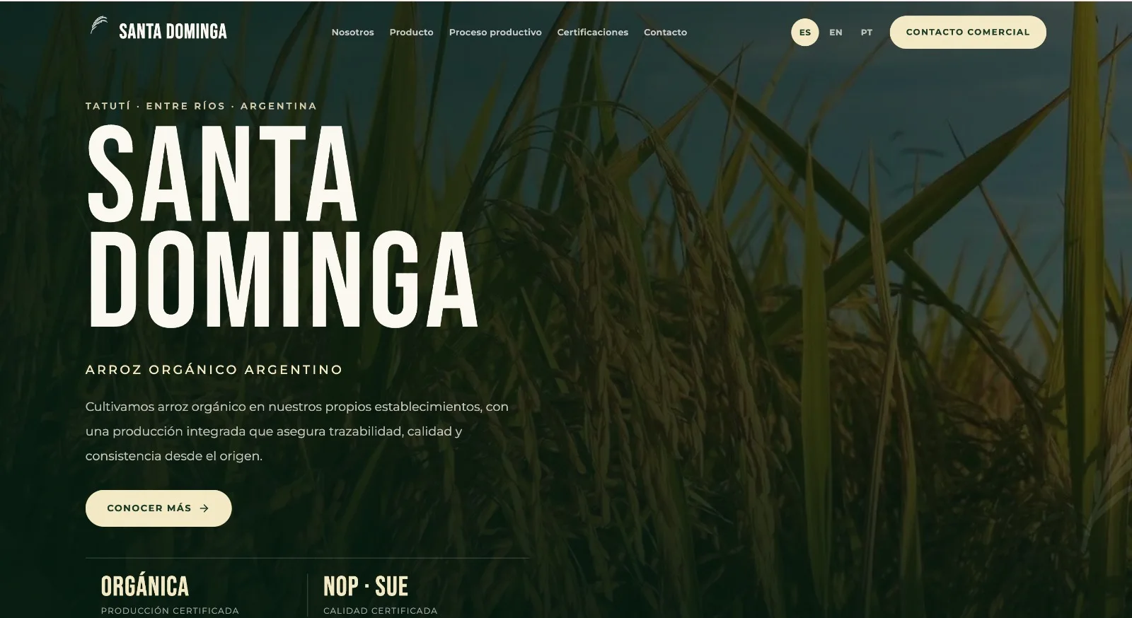
A three-language institutional website that organises two varieties, certified documentation and commercial contact within a clear experience.
What we did
- Information architecture
- UX / UI design
- Web development
- Three-language website
Information architecture + UX / UI design + web development
The challenge
Organising a complex proposition for different audiences.
The website had to explain two varieties with different audiences and journeys, make its certificates visible and provide the same quality of experience in Spanish, English and Portuguese. Our work turned that technical and commercial content into an architecture that is easy to navigate.
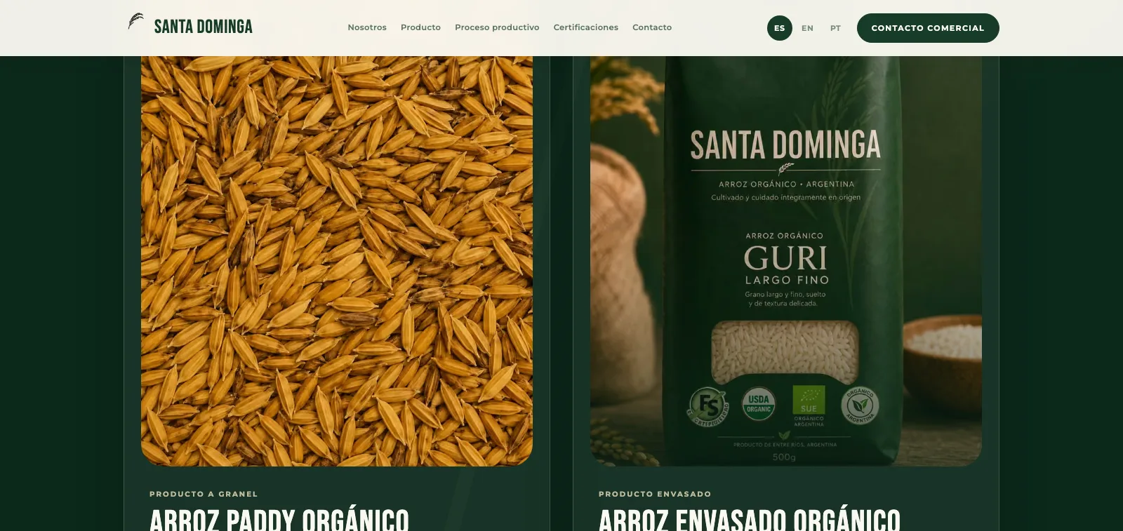
Two varieties, explained through distinct journeys.
We designed a structure that presents paddy rice and packaged Guri rice separately. Each variety has its own context, imagery and information while both remain part of the same visual and navigation system.
- A distinct hierarchy for each variety
- Content shaped for different audiences
- One shared visual identity
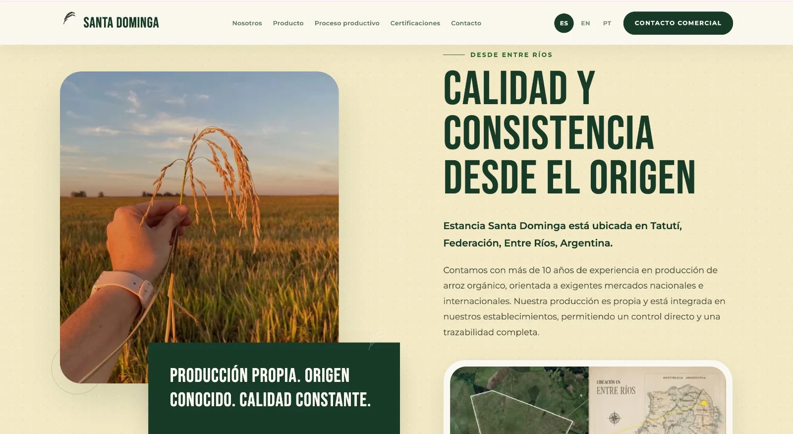
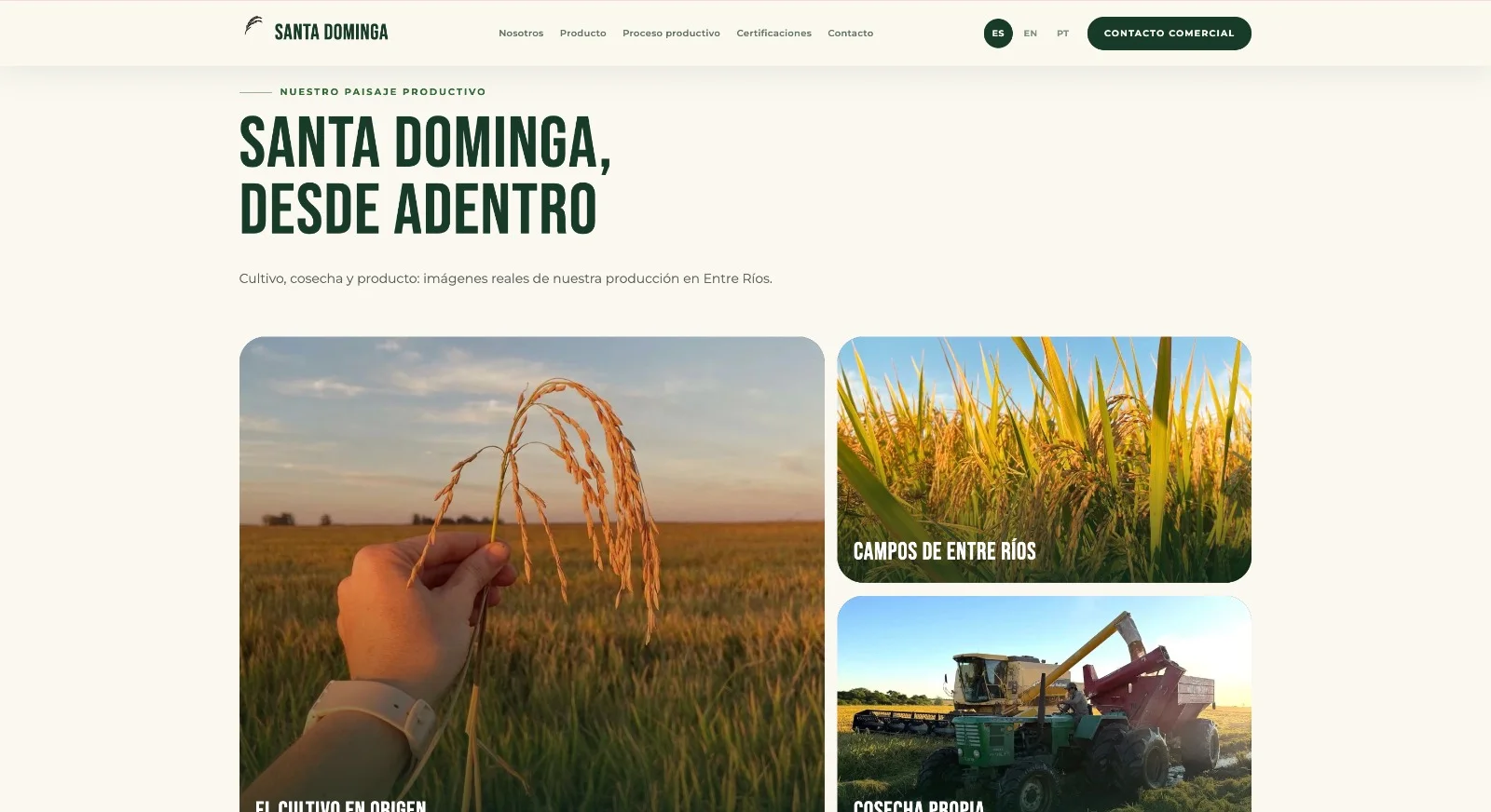
Origin and process become clear as the page unfolds.
We organised photography, copy and production stages as an editorial sequence. The website moves from place of origin through the production process without turning technical information into a dense block of text.
- A visual story structured by stages
- Technical information with clear hierarchy
- Editorial rhythm between text and imagery
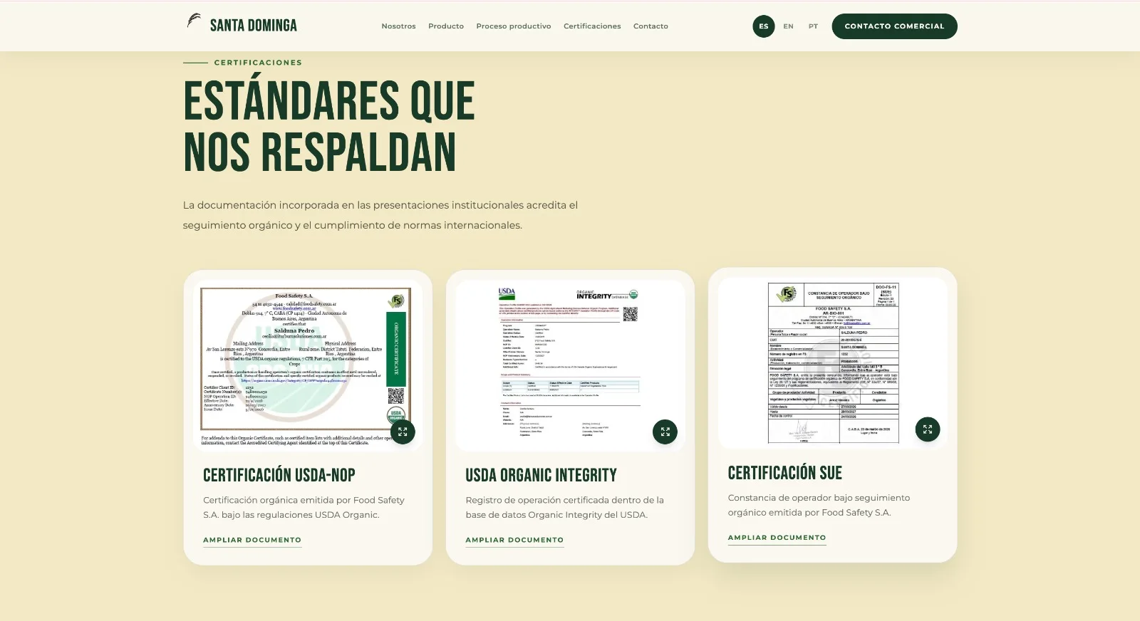
Key credentials are clear and verifiable.
We created a dedicated section to present the certifications, explain what each one supports and make the documentation available from the website. A central part of the proposition no longer sits hidden inside institutional copy.
- Dedicated certification section
- Documents accessible from the website
- Information presented with context
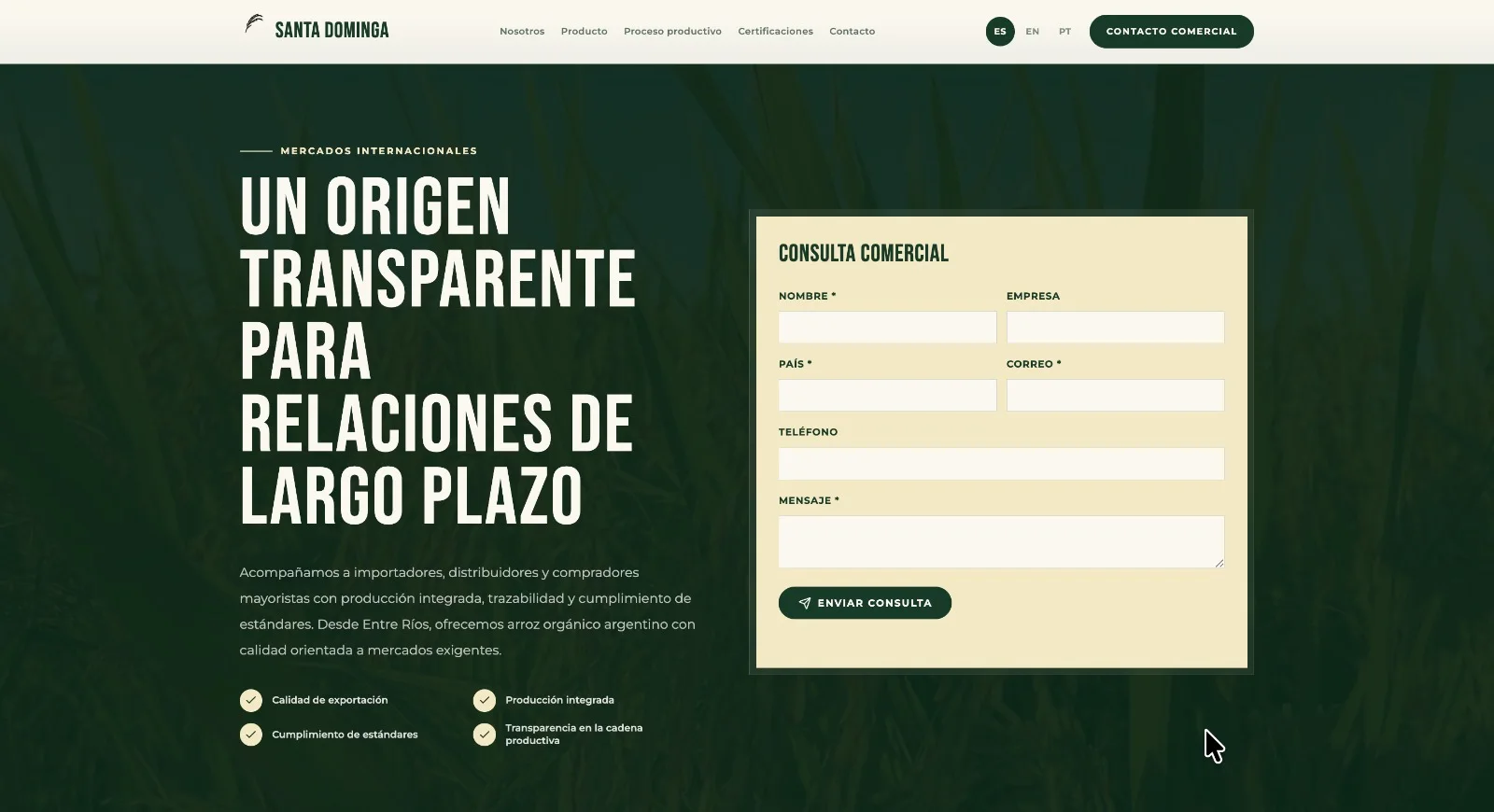
The journey ends with a well-prepared commercial enquiry.
After presenting varieties, process and certifications, we designed a form that gathers country, company and reason for enquiry. The page provides the necessary context before contact and helps each message arrive with useful information.
- Form integrated into the journey
- Fields designed for commercial enquiries
- Clear access from all three languages
A complete experience in Spanish, English and Portuguese.
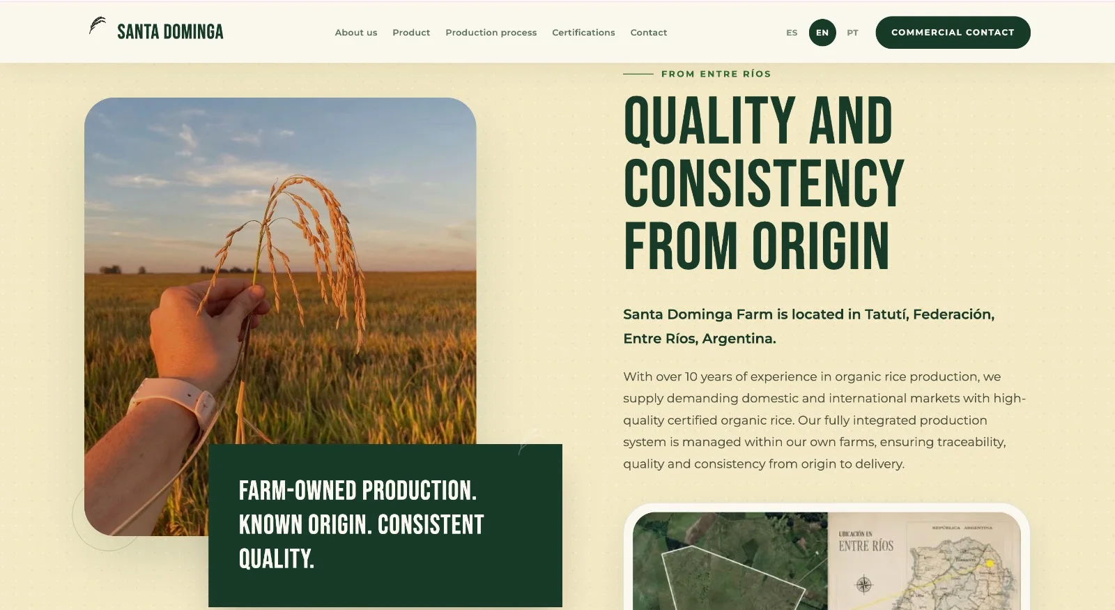
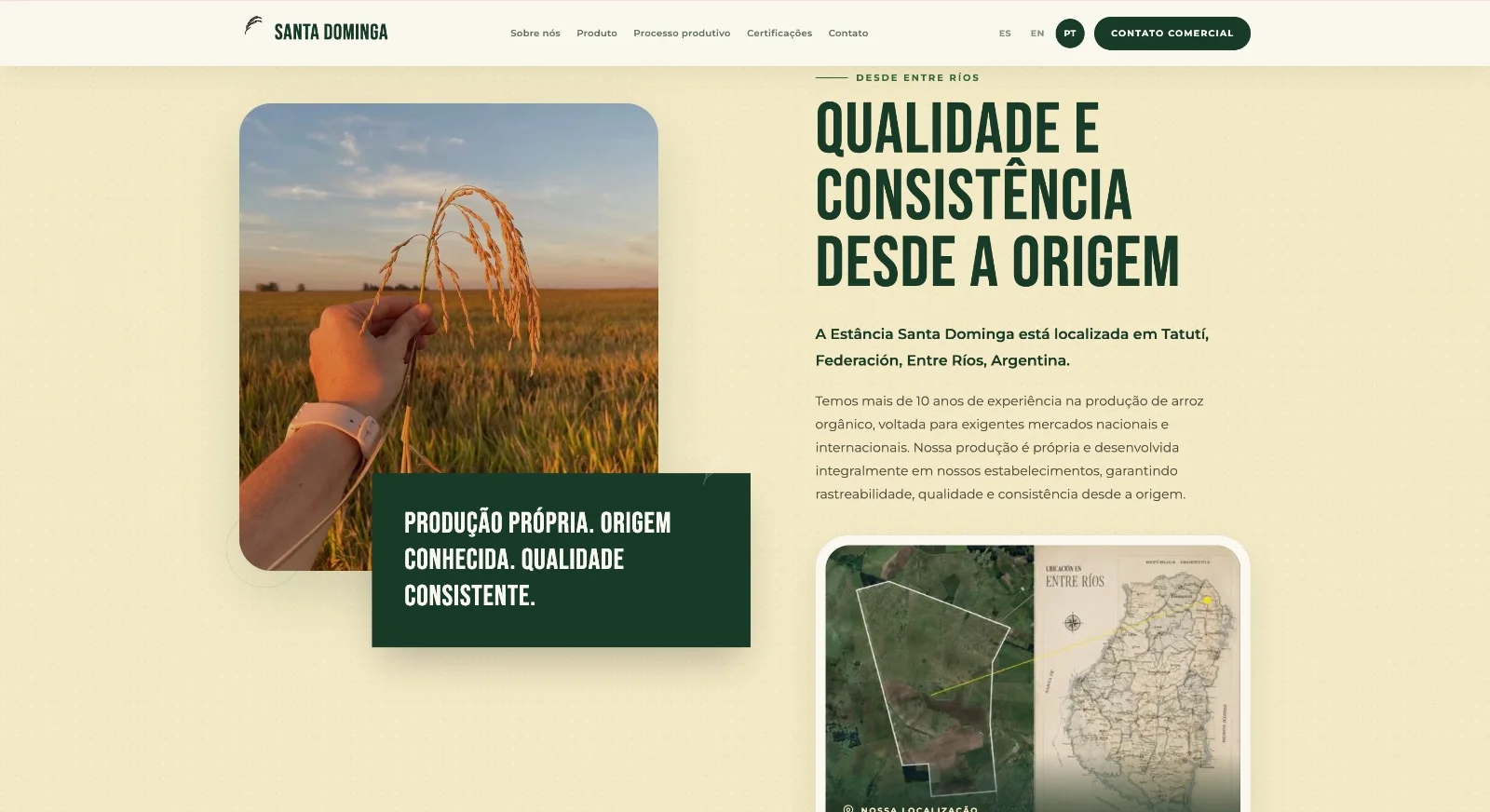
We developed all three versions with localised navigation, headings, copy and calls to action. The structure stays consistent so every language provides the same experience instead of feeling like an incomplete translation.
- Complete website in three languages
- Localised navigation and content
- The same hierarchy and experience in every version
What we built
A website that organises technical and commercial information, makes certificates visible and works fully across three languages.
- Architecture for two varieties
- Visual system and navigation
- Origin and production narrative
- Certificate section
- Document access
- Spanish, English and Portuguese
- Localised commercial content
- Enquiry form
Technology
- Next.js
- React
- TypeScript
- Tailwind CSS
- Framer Motion
- Lucide
Does your business need something like this?
Tell us what you have in mind and we'll think it through together. You'll hear back from us directly.